
Changed1
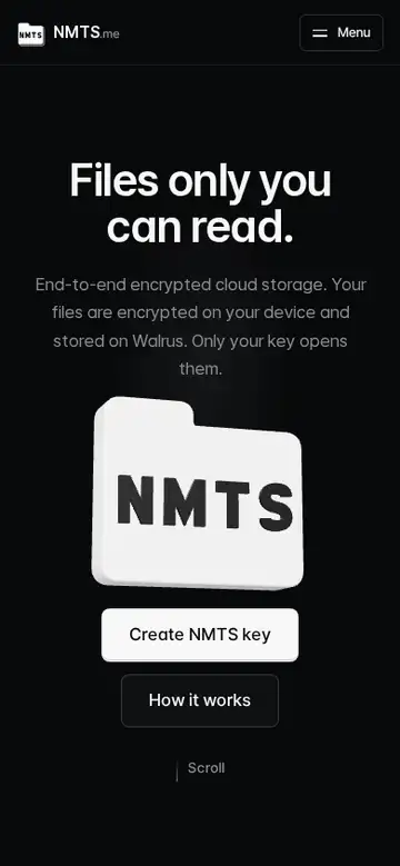
Below 640px the home follows a phone standard: title, text and the two buttons first and the 3D folder in a box below them; no landing lane and no empty band under the four choices; the comparison and key-loss tables read as cards with a label on every cell; the typing demo stacks its two panes; buttons are at least 44px tall.
The phone page was the desktop column squeezed: the folder covered the two hero buttons, a 360px band sat empty under the four choices, the comparison table's header covered its rows and its third column was cut off, and only two of the four key-loss columns were visible. Each of those is measured by a new test at 360 and 390px. What it still does not do: the header and footer keep their earlier phone layout.