Added2
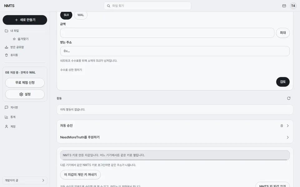
Send is four pages (coin, amount, address, check), swap is three, and storage control is a page of its own instead of cards under the wallet home.
Each page asks one thing and has one big button. The amount page shows the balance and a Max chip, the address page has a Paste chip, and the check page lists amount, address and fee cap before you sign. The send screen is 16 words where the old card was 89.
Six settings rows open their own page: NMTS key, login length, device name, storage check, agent keys and AI accounts. The recovery module is a short row list with the ZIP button on top.
The rows used to unfold an old card under themselves. Now each has an address, so the back arrow returns to the module and a saved value shows on the row. The recovery screen went from 1,777px and 230 words to one screen with the explanations folded under Details.
Fixed2
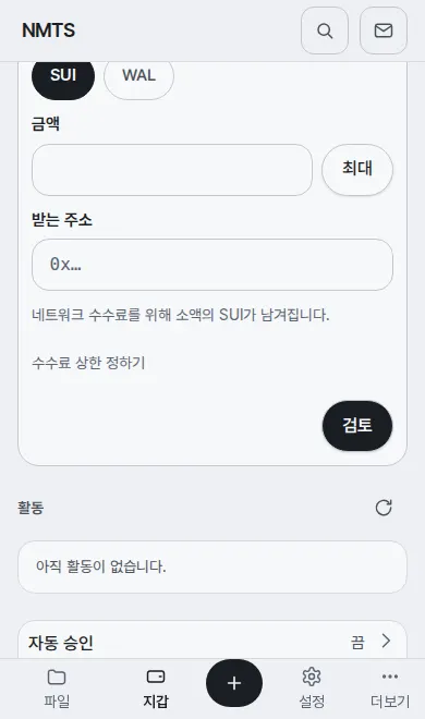
The phone's bottom bar sits at the very bottom from the first screen, and the + is a 56px circle with a thick stroke, always dead centre.
Chrome on Android draws pages to the bottom edge now and shows a chin at first. A bar padded by the safe area alone floated above that chin until you scrolled. The bar now grows by the largest inset and sits that much lower, as Chrome recommends. The + was the only fixed-width item in a flex row, so wide labels pushed it off centre; a five-column grid holds it in the middle.
On a phone the button of a signed-in step page no longer sits under the bottom bar.