Changed4
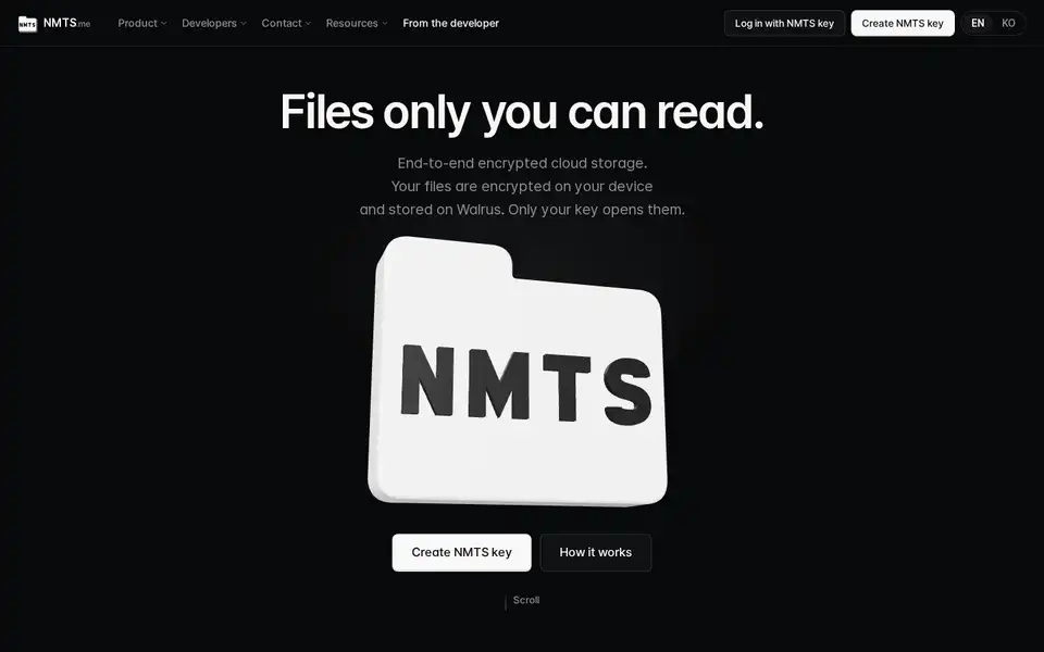
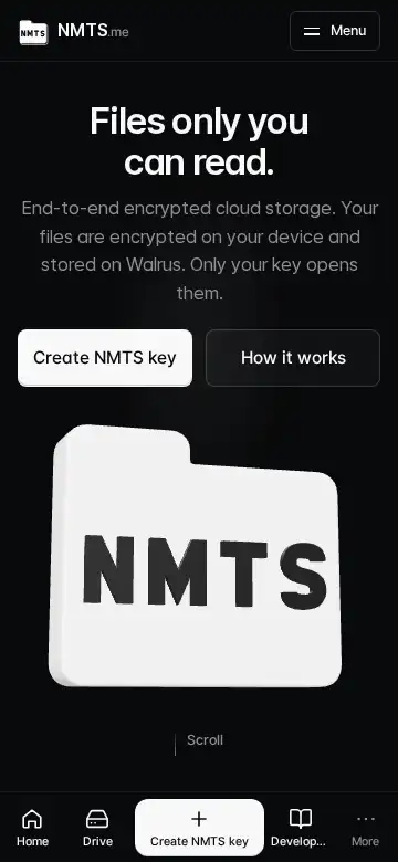
The phone header shows a 40px logo and a larger wordmark on the left and a three-bar menu button on the right; the menu drops down as a full list that scrolls inside itself, with 「Log in」 and 「Get started」 at the top and language and theme at the bottom.
The bottom bar's middle button reads 「Get started」 and the fourth tab 「Developer docs」; the More sheet and the footer list the developer's site, GitHub, X, Discord server and the CLI on npm; every path that is not the word 「Log in」 leads to key creation, including a logged-out visit to the drive.
「Developers」 alone read as the person who makes NMTS rather than the people who build on it, so the tab now names the docs. A logged-out person who opens the drive now lands on key creation instead of the login screen; the login screen is reached only through the word 「Log in」. What it does not do: the account and inbox pages still send a logged-out visitor to the login screen.
Key creation on a phone: 「Already have an NMTS key? Log in」 sits right under the create button on the first screen; after the code appears the screen reads as three numbered steps with the continue button pinned to the bottom; the survey's skip is one full-width tap. The proofs and acknowledgements are unchanged.
The login link sat at 769px on a 780px screen because the trial card and two notes came first; those now follow the button. The recovery-file proof, the recovery-map acknowledgement, the terms acknowledgement and the human check stay exactly as they were. What it does not do: it does not shorten the number of confirmations.
On phones the home scrolls natively: no smooth-scroll engine, no shatter overlay, no flying letters, and the 3D folder draws only when something changes. Measured: zero frames drawn while idle.
Fixed1
On Firefox and Safari the phone menu opened as a 56px strip and the bottom tab bar drifted with the browser's address bar, leaving a black band: the header's blur effect had confined them. The blur is gone below 640px, the menu is rendered outside the header, and the page carries its own background.
A blur effect on an ancestor turns it into the box that fixed elements are measured from, so the full-screen menu was measured from the 56px header and the tab bar could not follow the visible screen while the address bar animated. What it does not do: the desktop header keeps its blur.